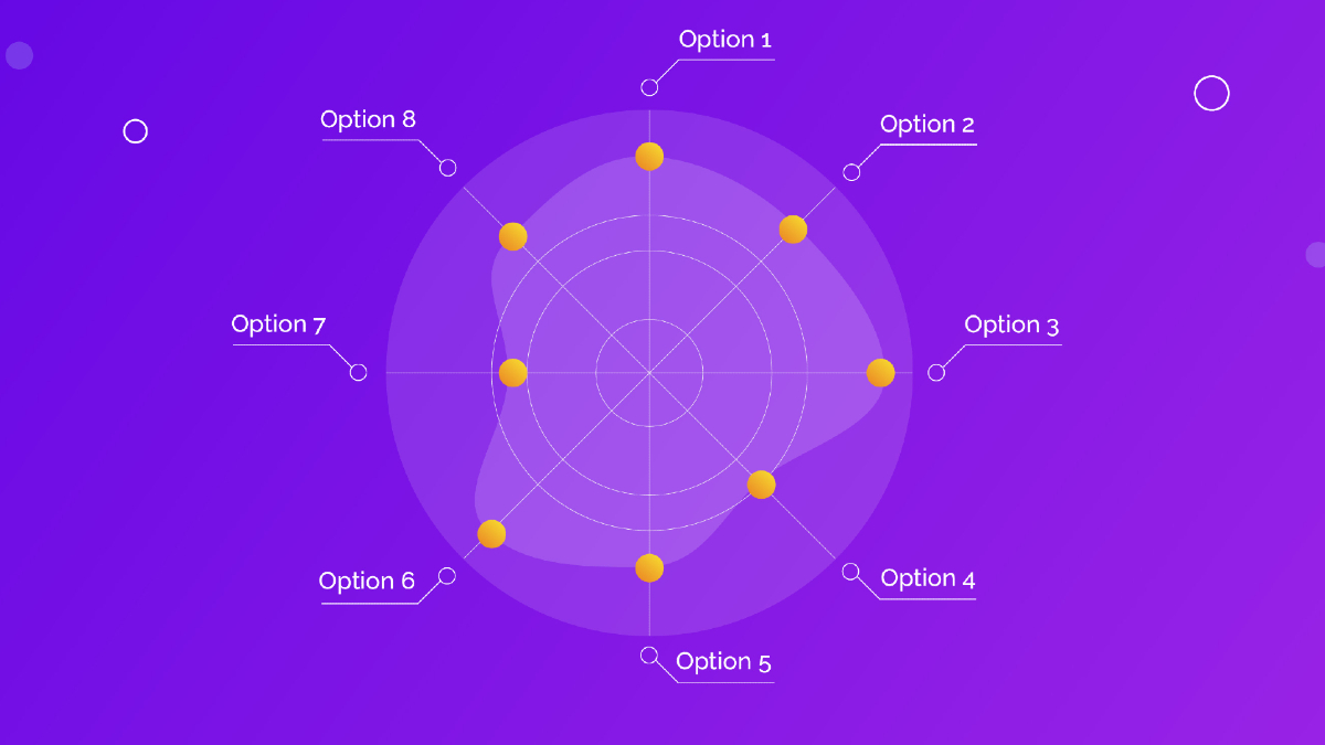
Being familiar with various types of charts and graphs is essential for efficiently interpreting data and conducting successful analyses. One such type of chart is the radar chart, also known as a spider or web chart. Regardless of its terminology, its functionality remains reliable in presenting statistical data. Below, you will find a comprehensive discussion on what a radar chart is, its importance, different types of radar charts, ways to create one, and the best practices for interpreting them.
Understanding the Basics of Radar Charts
Before delving into the specifics, it’s noteworthy to understand the fundamentals of a radar chart. It is a two-dimensional chart designed with at least three variables displayed on the axes that originate from the same point. It is called a ‘radar’ chart because of its resemblance to the radar screen used in navigation and detection systems.
Radar charts allow multi-variable data visualization, offering viewers a comprehensive view of various data points and their correlations in a single glance. It is an interactive way of representing data because of its unique visual presentation, making it easier for targeted viewers to appreciate the underlying insights being presented.
An essential part of understanding the basics of radar charts includes knowing how to interpret them. The plotted points for each variable join together to form a polygon or ‘web.’ The area covered inside the polygon presents the cumulative effect of the variables. This visual representation makes comparisons and analyses tremendously straightforward.
Lastly, understanding the basics of radar charts also involves comprehending their limitations. When there are numerous variables or categories to be displayed, radar charts can become messy and confusing. Thus, knowing when and how to use them is an integral part of mastering radar charts.
The Importance and Applications of Radar Charts
Radar charts hold significant importance in the field of data visualization for their ability to display multiple variables simultaneously. This characteristic comes in handy when needing to conduct comparative analyses, making them valuable in several areas ranging from business to sports analytics.
In the realm of business, for instance, companies often use radar charts to analyze their performance across various sectors, such as sales, customer service, and human resources. By comparing the company’s different aspects, they can quickly identify strong and weak areas and make strategic improvements accordingly.
Radar charts also find applications in sports analytics, where individual athletes or teams can compare and contrast multiple performance measures simultaneously. This holistic data representation allows for a comprehensive overview of team strengths and weaknesses that can influence game strategy.
Moreover, the field of healthcare also renders use of radar charts. They are often used to track and compare patients’ health progress across a multitude of sectors, inclusive of physical tests, lab results, and patient-reported outcomes over a certain timeframe.
Exploring Different Types of Radar Charts
Radar charts can be categorized into different types based on their presentation and the number of variables they portray. One such type is the standard radar charts that display data points on each of the x- and y-axes, connecting them to form a polygon for easy comparison of various components.
There are also filled radar charts, where the area within the polygon is filled with color. This type of chart is particularly helpful when expressing the total impact of various factors as it provides a visual representation of the cumulative effect.
If you want a deeper dive into the topic, you can further explore types of radar charts to expand your understanding and knowledge. Understanding the numerous types of radar charts can contribute to choosing the right chart for your specific needs, making data presentation and interpretation more effective.
Lastly, there are multivariate radar charts that feature more than one respondent. These charts are valuable when comparing different elements or individuals across multiple categories, providing a comprehensive overview of interactive data.
Altogether, radar charts are a powerful tool for multi-variable data representation. From understanding the basics and their importance to exploring different types to creating your radar charts and best interpretive practices, mastering these charts can go a long way in perfecting your data visualization skills.


